T-Shirts
Shop nu


Napapijri’s logos: heritage and visual codes
An elevated logo is defined by restraint. In contemporary fashion, elevated logo meaning often centres on refinement. Iconic motifs are reworked through tonal applications, embroidery, texture, and proportion. The symbol remains recognisable, yet its presence becomes more nuanced.
At Napapijri, this approach is rooted in history. From the Antarctic stamp to the Norwegian flag and the black and white mark, each logo represents a chapter in the brand’s evolution. Together, they form a graphic language that connects exploration, craftsmanship, and modern design.

The history of the Napapijri logo
The history of the Napapijri logo begins in 1987, at the foot of Mont Blanc. Inspired by polar research and expedition culture, early designs referenced mapping, discovery, and movement.
The stamp, depicting Antarctica, emerged as a symbol of research and progress. The Norwegian flag followed, honouring the explorers who shaped the mythology of the North and South Poles. The black and white logo introduced a bold duality, half positive and half negative, visually linking two extremes of the globe. Each emblem carries a distinct meaning. Together, they articulate identity.

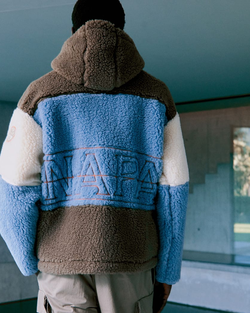
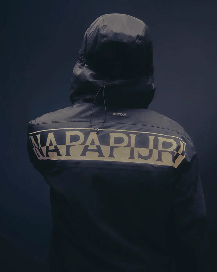
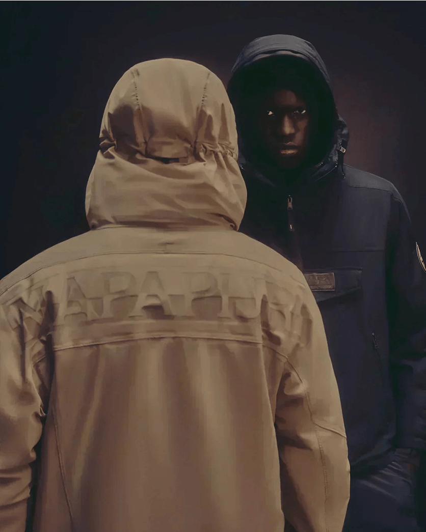
The black and white log: Graphic duality
The black and white Napapijri logo embodies the brand’s core value of duality through its half-positive, half-negative construction.
It is a visual dialogue between presence and absence, North and South, material and immaterial. This chromatic and structural tension reflects the pioneering attitude of the founders: a balance between exploration and groundedness, technical precision and creative openness.
By uniting opposing forces into a single, coherent mark, the logo becomes a symbolic bridge across extremes. It represents the transformative power found in the space between them.
Most of the time, it appears on T-shirts, box logo silhouettes, including sweatshirts and joggers, and other cut-and-sewn pieces. It is also prominently featured on key icons such as the Skidoo Jacket, the Rainforest Jacket, and the Bering Duffle Bag. Here, the mark functions as a confident signature. Direct, graphic, and rooted in the archive.

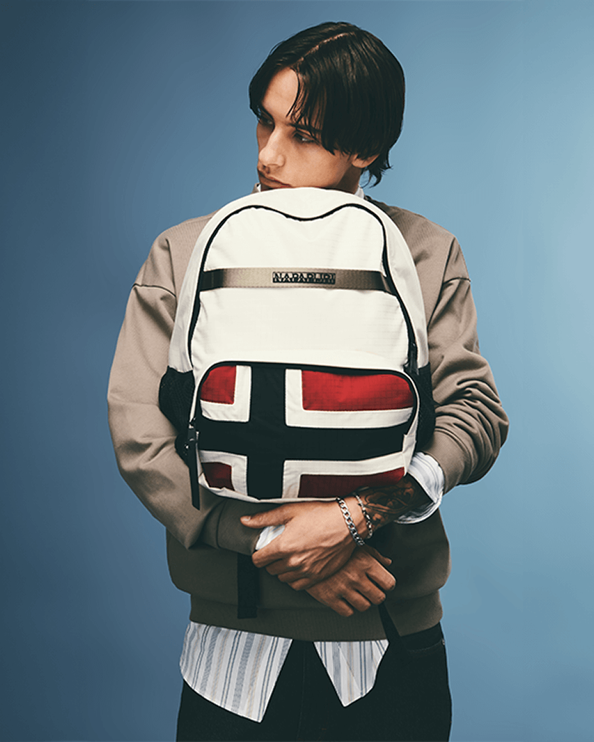
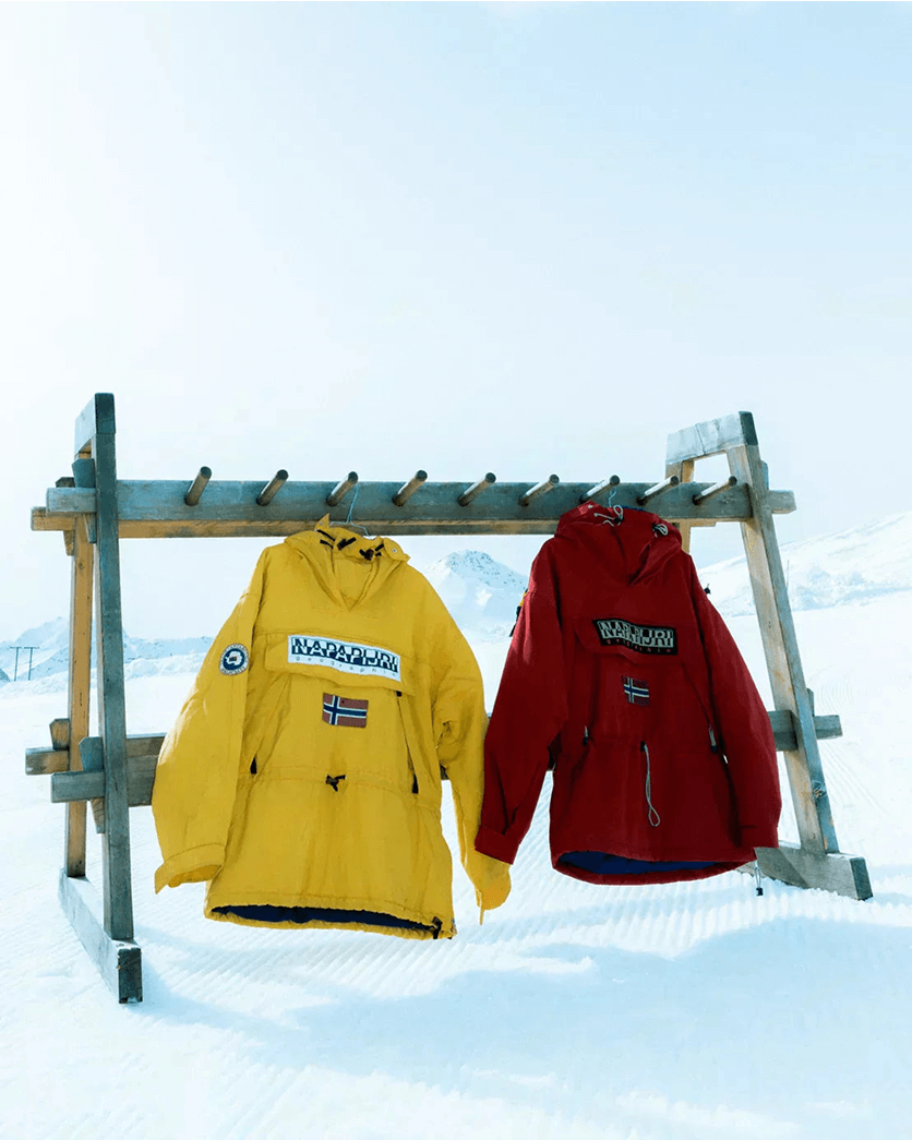
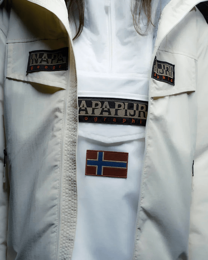
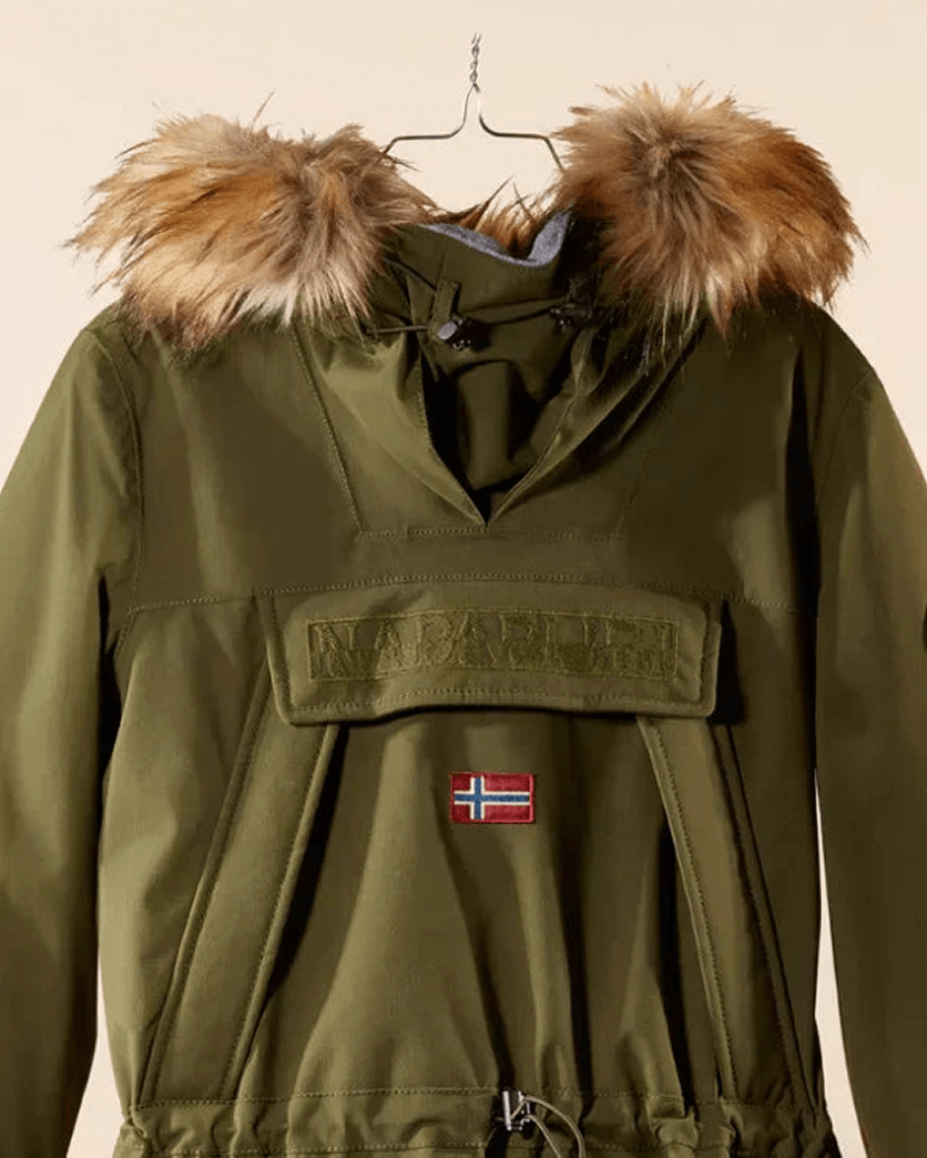
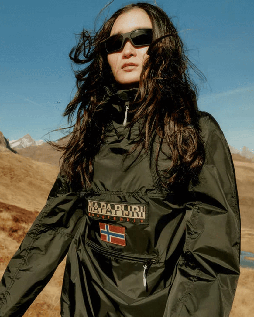
The flag: The Nordic cross
The national flags of all Scandinavian countries use the Nordic Cross. Napapijri chose the Norwegian flag as it was the first Nordic Cross carrying three colours, and it represents the great explorers who embodied the dream of polar exploration.
In religion and art, the cross is one of the richest and most enduring geometric symbols. Its vertical axis ascends, while the horizontal axis stands for earthly life. It represents crossroads as places of reflection, where change takes place. To reach a crossroad is to come face to face with the unknown.
Most of the time, the flag can be found embroidered on shirts and jumpers, where it integrates naturally into the garment. It also appears on fleece pieces in rubberised versions and on accessories such as bobble hats. In tonal applications, the symbol is rendered in subtle shades that blend into the fabric, reinforcing a refined approach to subtle branding in fashion. The identity remains recognisable, yet understated.

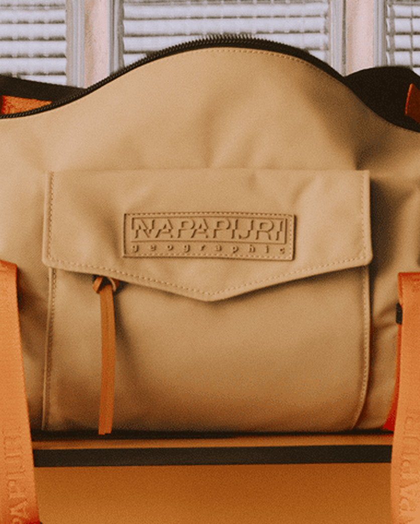
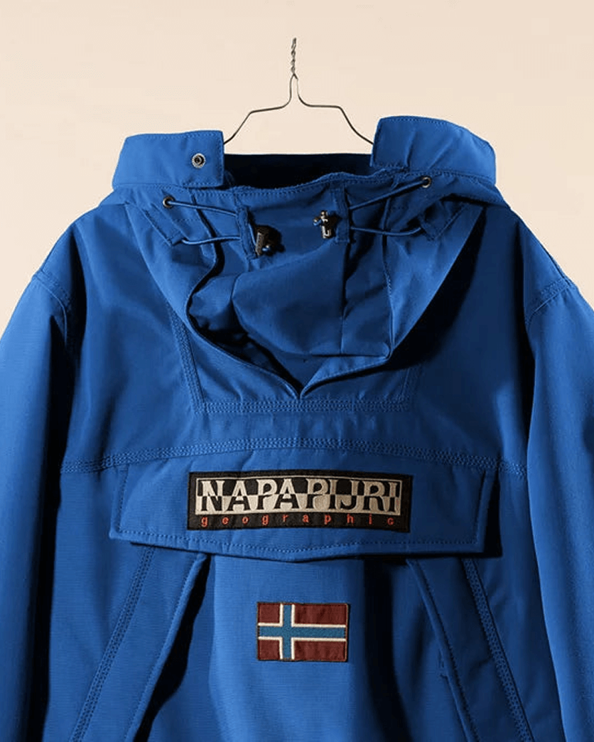
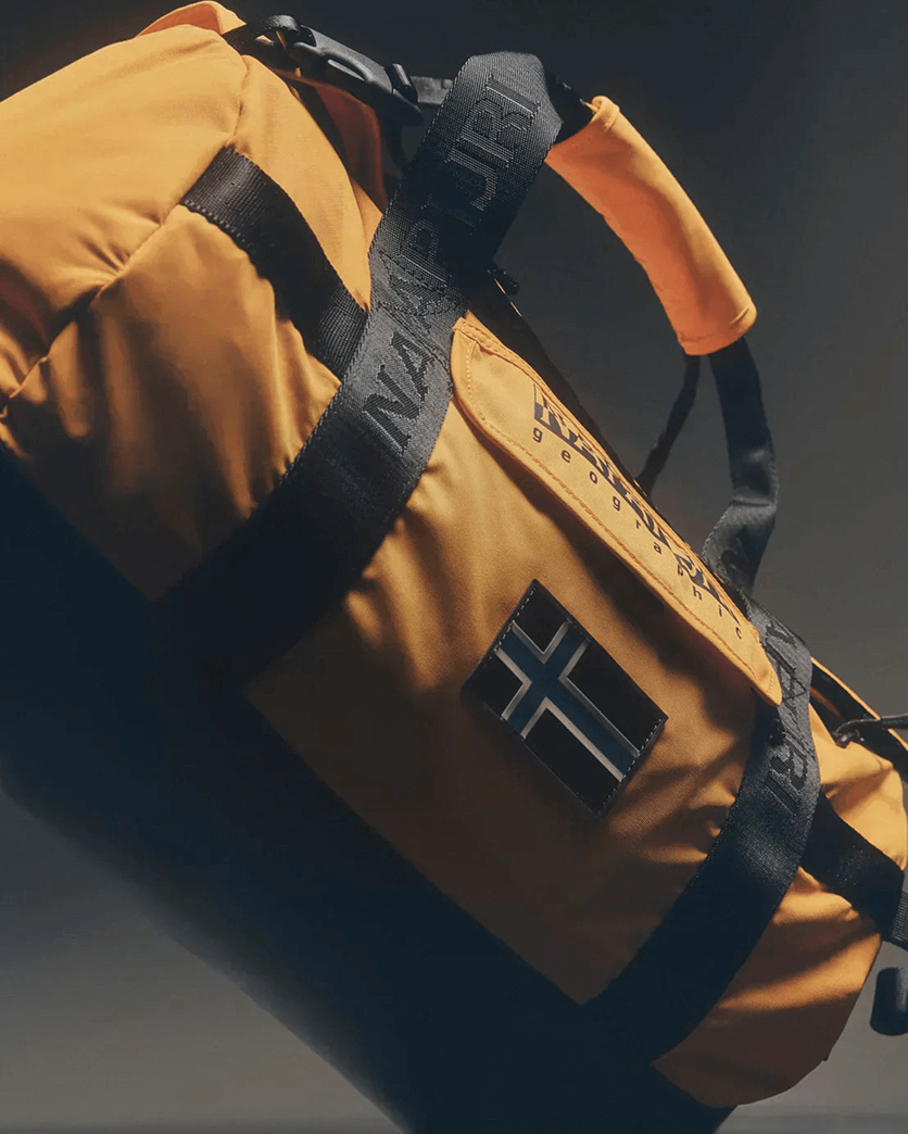
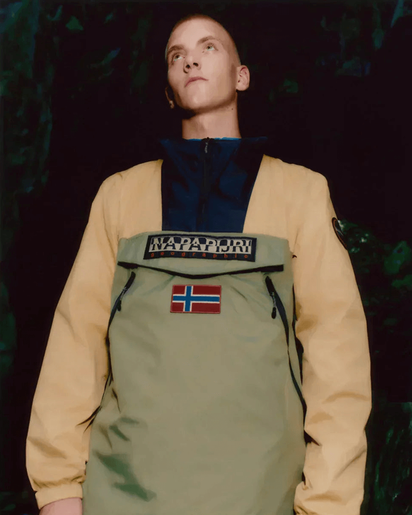
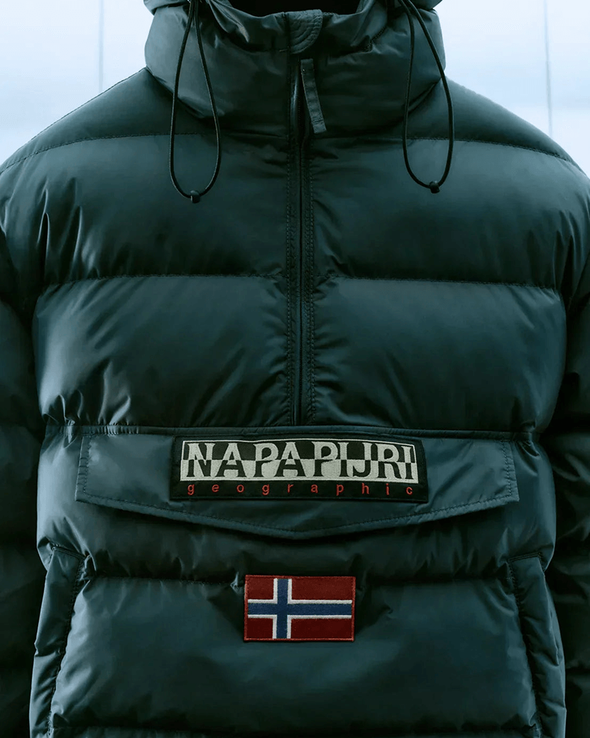
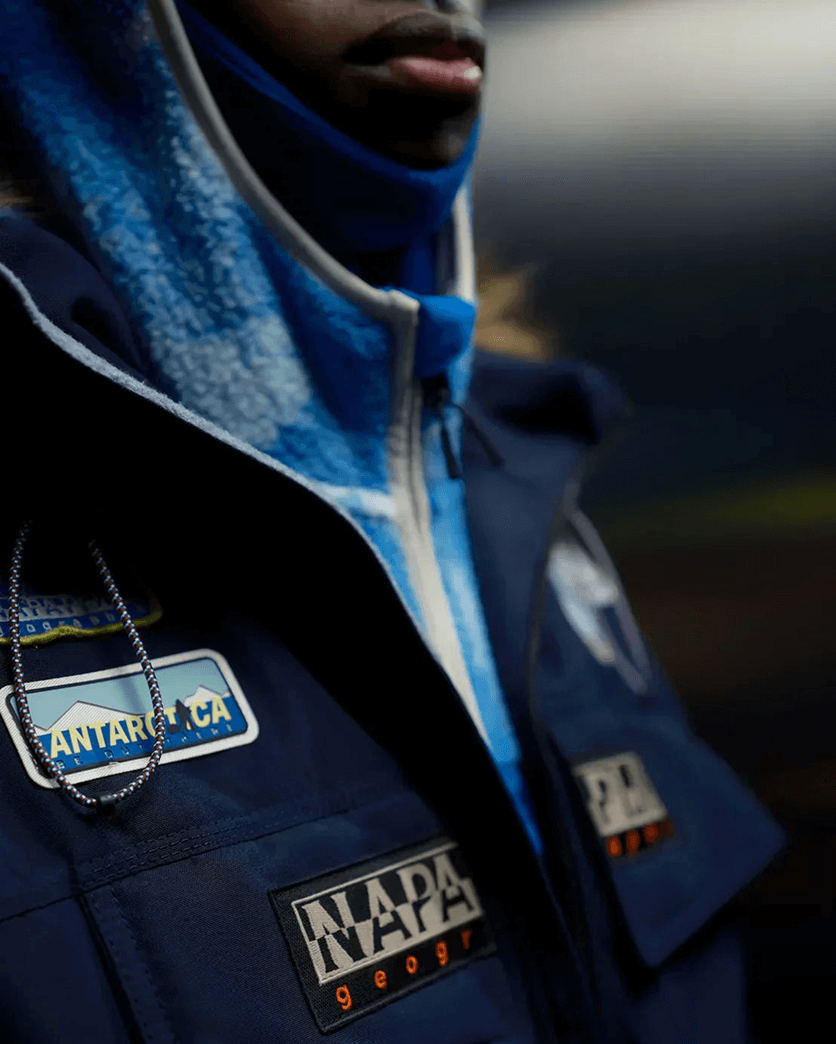
The stamp: Mapping discovery
The different elements of the Authentic Bollo speak the language of discovery, progress, and innovation
Following the dual structure of the brand logo, it features a map of Antarctica embedded within a series of signifiers linked to map-drawing and geographical research. These elements symbolise the pursuit of innovation in outerwear and reinforce the brand’s expedition-inspired roots.
Most of the time, the stamp can be found on men’s outerwear. Seasonal iterations and tonal versions also appear within the women’s offer, as well as on accessories such as travel backpacks. Its circular composition recalls official research seals, signalling authenticity and continuity while remaining relevant in contemporary design.

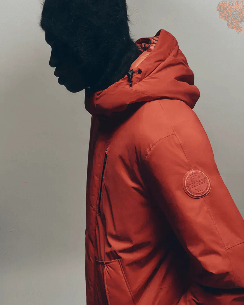
Elevation through subtlety
Across silhouettes and categories, logo placement follows a narrative rather than a strict rule. Outer layers often carry the stamp. Knitwear and shirts frequently feature the flag. Essentials and iconic styles prominently display the black and white mark.
This coherence strengthens recognition while allowing variation.
In a landscape where subtle branding in fashion signals authenticity, Napapijri’s visual codes demonstrate continuity. Heritage is not static. It is refined, reinterpreted, and carried forward through design.
Explore the latest silhouettes and discover how Napapijri’s visual codes continue to evolve across outerwear, knitwear, and everyday essentials.
Heritage remains at the core. Design carries it forward.